Part 2 of my DIY series – Chart Web Parts! This web part is out of the box with the Enterprise version of SharePoint and seems to be one of those web parts everyone forgets about. With all of the excitement around complex BI and reporting options like Performance Point, SSRS, and even Excel Services, the Chart Web Part tends to get buried under a wealth of big ideas for big projects. The Chart Web Part, while basic, can serve those looking for the ‘quick win’ and the ever so popular ‘low hanging fruit’ projects while they wait for the larger BI plans to pan out.
Before we dig into the details, I wanted to share a quick story. I had a client burdened by their manual processes. They had an application that continually fed data into SQL . This data was critical information on the processing line for the items they manufactured. They had an engineer that spent every day exporting this data into excel, manually removing the null values, and then creating line graphs that could be analyzed. They did understand the need for BI, but the budget for that was not until the next fiscal year and they just had this feeling they could do better in the mean time. This was the perfect example for the chart web part. I set them up with 6 or 7 pages with 5 graphs each, filtered by date. Very easily, a manual and tedious process was automated and the client (and his boss) were thrilled and they didn’t have to spend a ton of money.
To set up a chart web part, you must first have a set of data and an Enterprise license. For those that have Foundation or Standard, check out this free Amrein chart web part.
For the data – you can download my sample Sales list template here. Just save it to your list templates on the site and create a new list from the DIY Sales template. Once the list is in place, you can begin creation of the web part.
1. Edit a Page and select Web Part from the Insert tab on the ribbon.
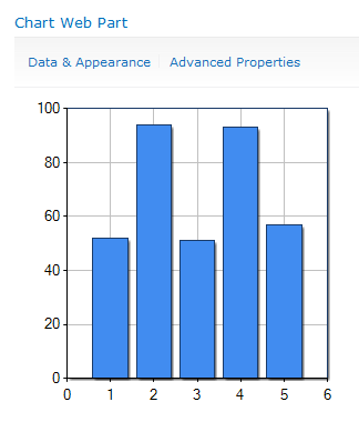
2. Select Chart Web Part from the Business Data category and click Add. You are presented with a web part that looks like this
3. Click on Data & Appearance (you may be prompted to save changes before continuing, go ahead and accept) and select Connect chart to data.
4. For this example, we are going to connect to a basic SharePoint List. Select that radio button and click Next.
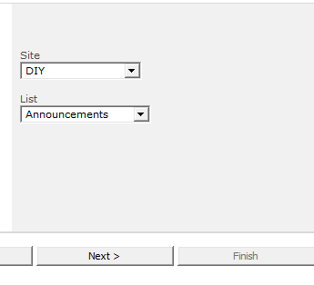
5. From the drop-downs, select the site and list. Then click next. Notice you don’t have to select a list in the same site!
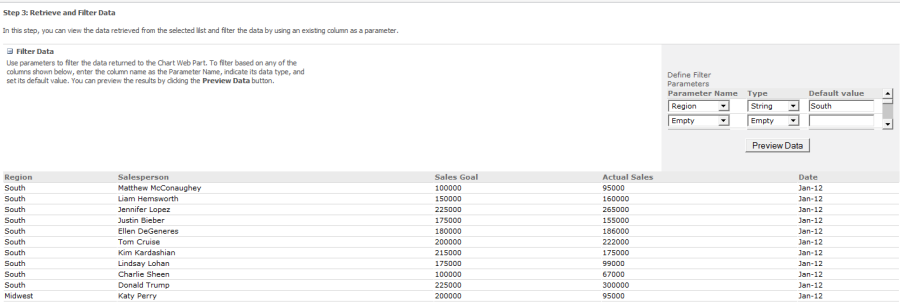
6. The data from the list is presented. At the top of the list, a Filter Data option is available, click the plus sign to expand the feature. Tip: if you have a lot of columns, you may have to scroll to the right to see the Filter fields.
7. By setting filters here, you will be able to connect to filter web parts. For this example, I am going to set the Region to South as type string, and set Date to Jan-12 as type string and then preview the data. (note: eventually I will do a separate post about the date field type, they can be tricky. For simplicity this example will use date as a string/text field) It appears you have to set a default value, but the data presented is not limited to this subset. Click Next.
8. Choose your X and Y axis fields. I am going to set Actual Sales for Y Field and Name for X. Other fields are available like tooltip – this is particularly helpful on a line graph. Set tooltip to Sales Goal and click Finish.
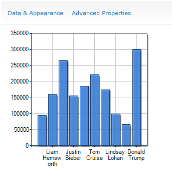
The chart has been started but it still needs some work. It may look something like this right now
9. Go back into Data & Appearance, but this time select Customize your Chart. On this screen you can change the type of chart you want to work with. For this example, we are going to keep the default bar chart.
10. Expand Step 2: Chart Appearance Properties and select Appearance Themes. Change the chart width to 700px and the Chart Height to 300px. Change Transparency to 0% Solid and click Next.
11. Select the check box to Show Chart Title. Increase the font size and make it bold. Provide a title for the chart like Sales Performance. The legend can also be shown but will not be used for this example. Do not click Finish.
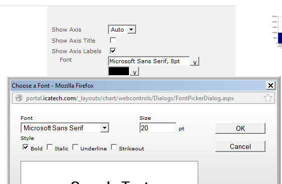
12. Expand Step 3: Chart Element Properties. Under the X-Axis settings, remove the check box for “Side Margins”, this will assist with displaying more information if needed. Under the Y-Axis settings, select the arrow next to Format. Use the drop down menu to change the format type to Currency and click OK. Now click Finish.
13. While the page is in edit mode, edit the web part again. Notice a number of options are available here as well. Scroll down to the Series section and change the option for color. Click OK to accept the changes. The chart looks pretty good but we aren’t done yet!
14. While the page is in edit mode, Select the Insert tab, Web Part and Add a Text Filter web part, found under the Filters category.
15. Select the arrow, but instead of going to Edit Web Part, select Connections, Send Filter Values to, Chart Web Part.
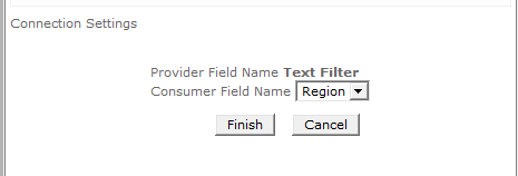
16. A prompt is shown. Select the Region field from the drop down. If you do not see the field you desire, go back to step 7 and verify your information is accurate. Step 7 determines which fields are available for selection here. Click Finish and save your changes to the page.
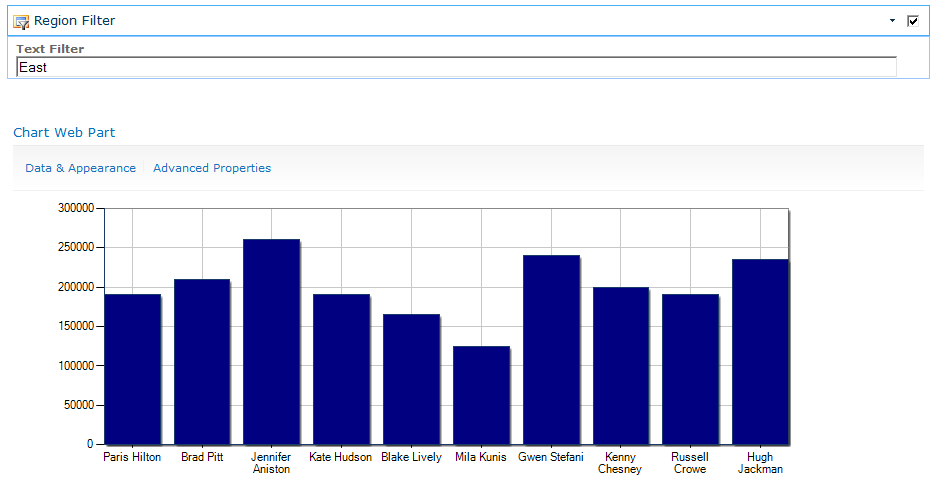
17. Use the text filter by typing a value into the field and hitting enter. The values on the chart update.
18. One last note – if desired, a default value can be set for the Text Filter under the Edit Web Part settings. The Data & Appearance and Advanced Properties can be hidden if desired as well.
That’s it!